I recently decided to use my Training Budget towards a technique that has caught my eye for the past year or so. I noticed that the Aussies were talking about it a lot, but it didnt seem as well known, or popular in the UK office: Graphic/ Visual Facilitation.
Lets get one thing straight from the beginning. I’m not an artist! I LOVE drawing and painting, but im certainly no expert, and I wondered how much drawing skill you needed in order to become effective with this tool. The answer is not much! Anyone can draw and represent themselves through images, even if that means stick men and square boxes!
Graphic Facilitation is about engaging your audience in a different way to typical Facilitation. The idea is that the content is captured in a way that is memorable and leads the audience to some shared understandings and conclusions.
This technique can be useful for scribes in meetings, for drawing up agendas and action plans, for capturing outputs in meetings and workshops, and feedback, among many others. I can imagine many workshops where I could put this into practise in my day-to-day work as an Analyst.
Here are some of the key learnings I have taken away with me:
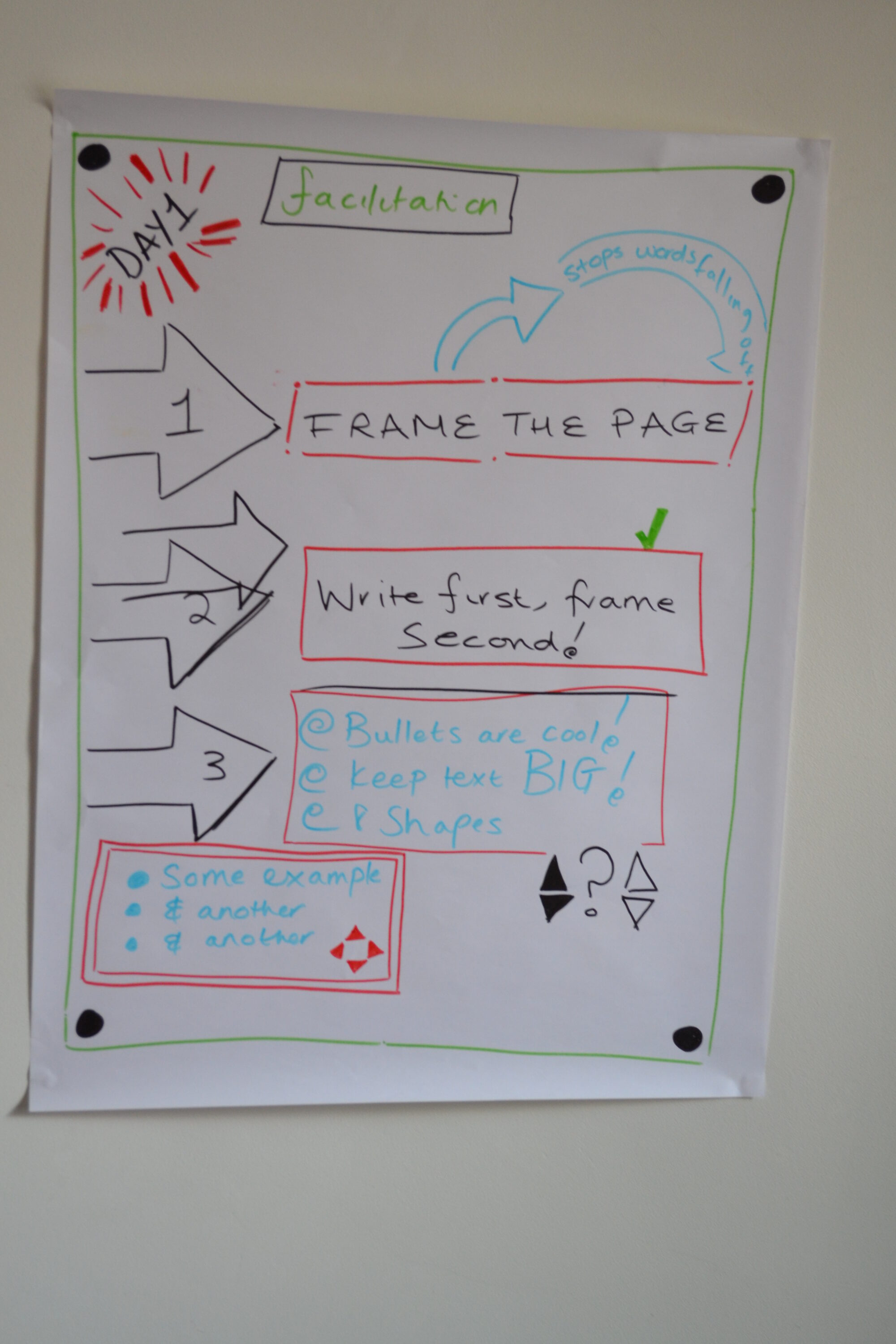
1) Frame the page
It’s important to frame the page, to draw the eye to where the audience ought to be focusing. This stops words from falling off the page, or becoming lost in a muddle. Its best to do this upfront, even ahead of time if you have some time to prepare. You want nice straight lines if possible. If you feel your hand going on a bit of a wobble, stop. put a little dot, and continue along your merry way. This makes it seem like its meant to look that way.
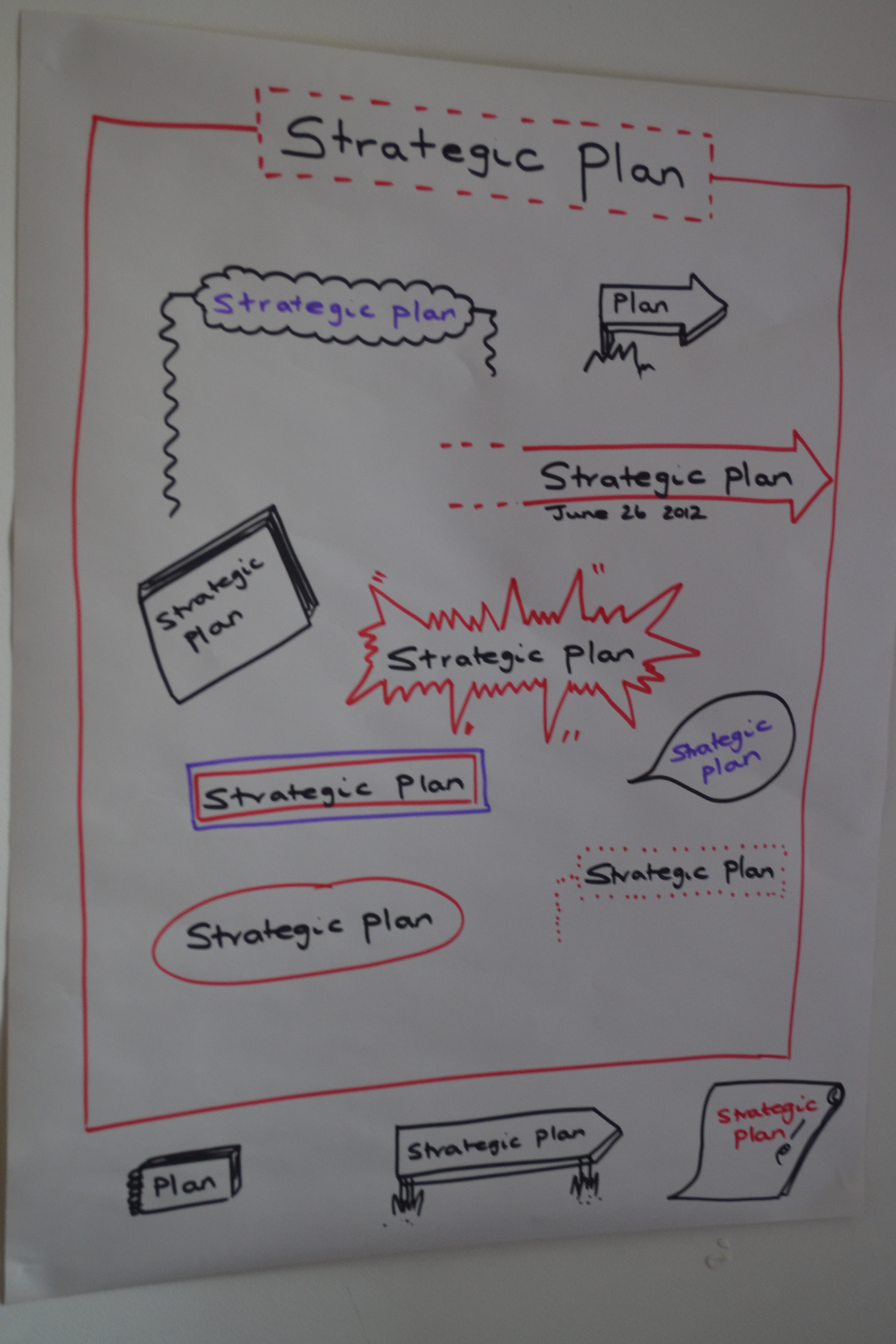
2)Title Headings
As well as Framing the page itself, Framing Headers and Titles is equally important to differentiate from the rest of the content.
We discussed different ways of doing this, including drop-shadows, dotted lines, different colour fonts etc.
If you use a colour in the title, be sure to use it somewhere else on the page, to make sure it ties back into the image as a whole. You can use it as part of your overall colour scheme (more on that later), or to draw attention to some aspect in particular by matching it with the title.
Top-Tip: WRITE THE WORDS FIRST, frame them second! Ever had that heart-sinking moment where you try to squish letters into a ready drawn shape, only to fail miserably? Yup..we’ve all been there! Writing first allows you to know exactly how big that frame ought to be! hurrah!
3) There are 8 basic shapes you will use/ adapt
- Squares
- Rectangles
- Circles
- Dots
- Arrows
- Lines
- Triangles
- Spirals
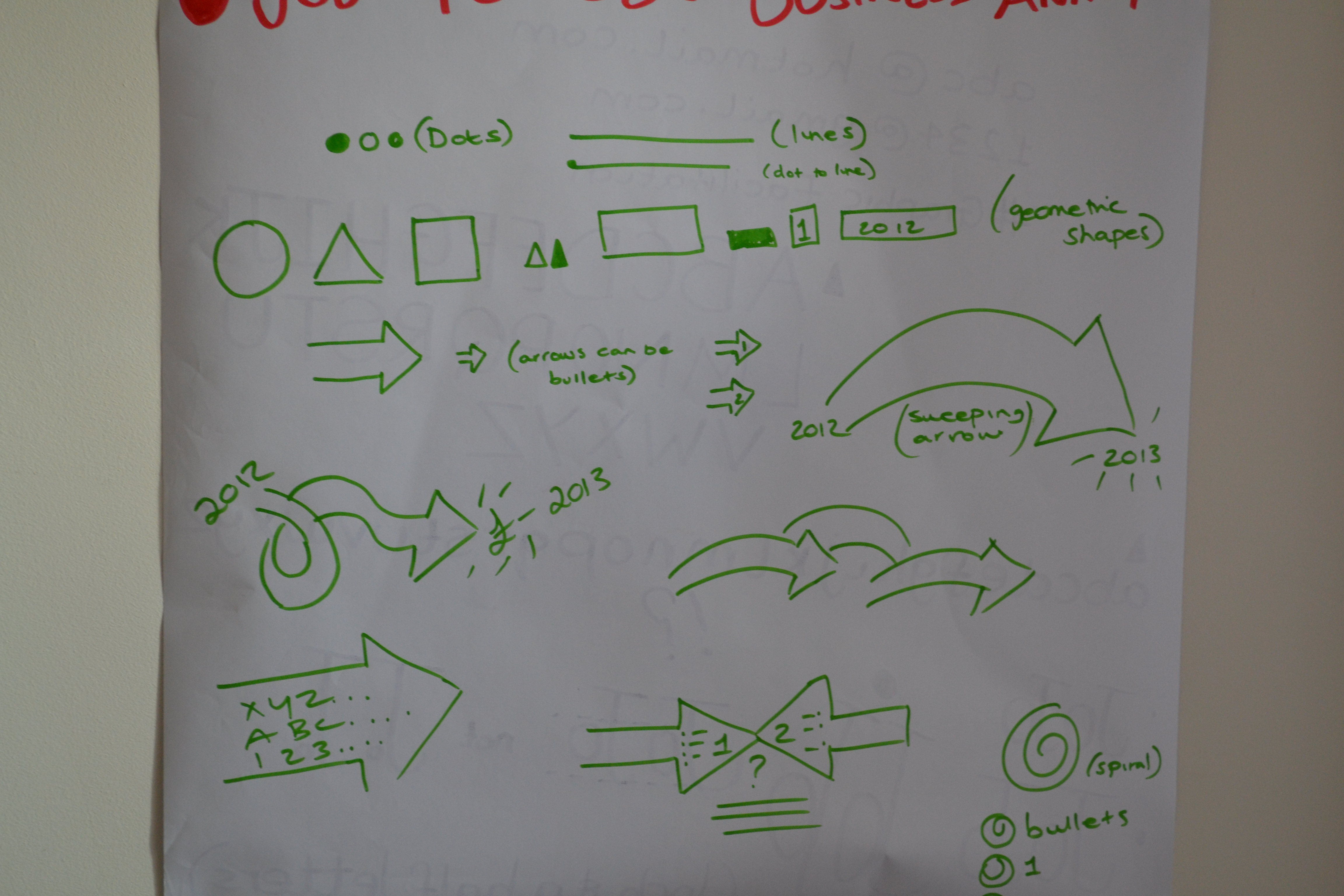
You can make these fat/ thin/ filled in/ empty and manipulate them to however you need- but they form your basic toolkit and you can always fall back on them.
I learnt that arrows containing text can make great bullet points, as can spirals!
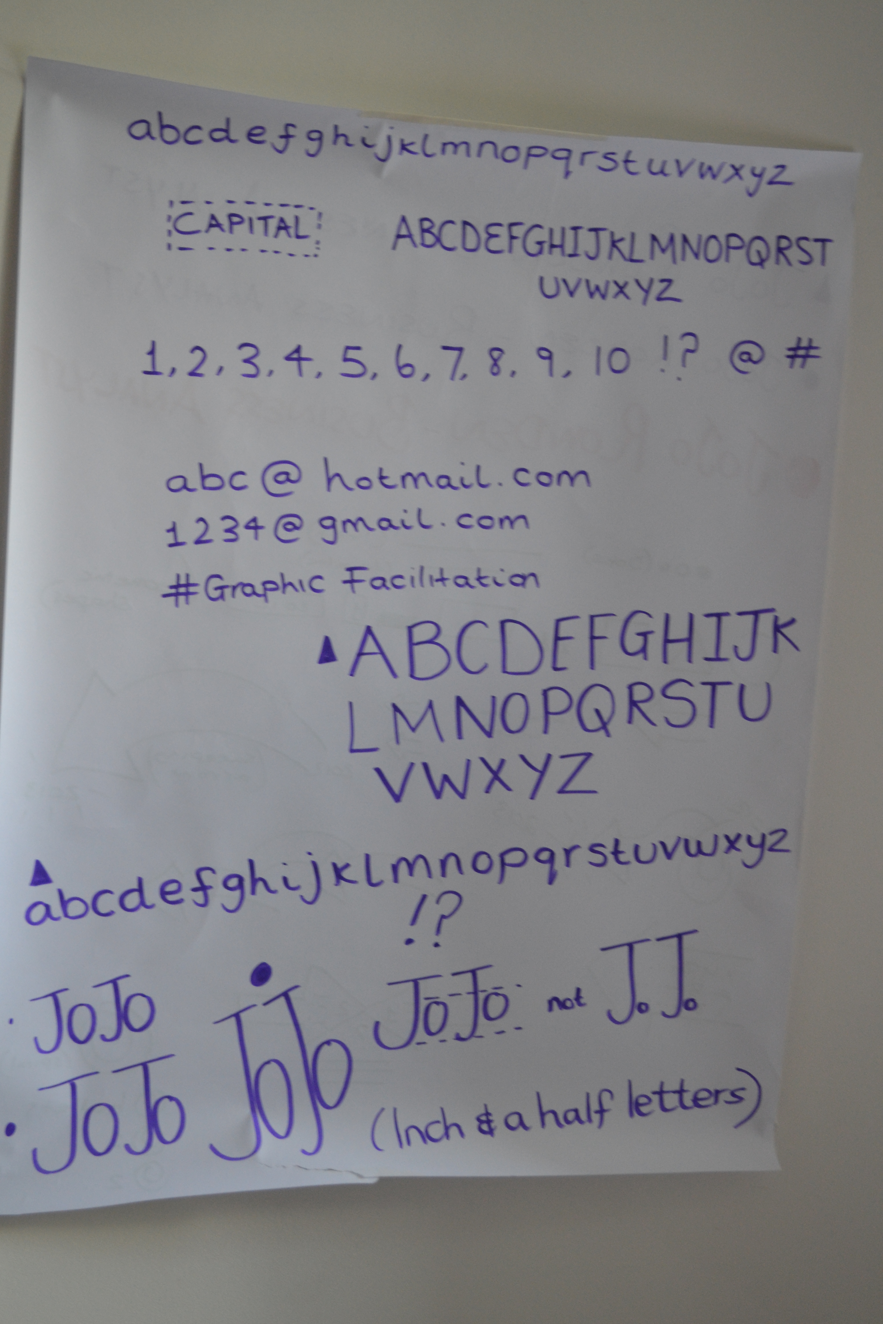
4) Writing
We practiced writing over and over! Fran drummed into us the importance of accessibility for those who are visually impaired. It is vital that letters are simple and large enough to be read across a room distance. She encouraged us to steer clear of fancy fonts for the important info that we capture and concentrate on ‘lines and circles’ to make up letters, or an Ariel style font. I discovered that words are more readable if letters are set closer together, and that ideally, lower text should be half- 2/3rds the height of the preceding capital letter!
5) Colours/Pens
Colour choice is important. Fran’s advice was to pick a couple of darks, that are best to write with, then had some ‘accent’ colours, for highlighting and engaging. You dont want TOO many colours, else the page looks like its been scribbled on by a small child with crayon! Remember that someone is potentially paying you to facilitate their session, and the outputs need to look professional. You should assume that it will be photographed and potentially circulated to any one that might have an interest in the content, including C-level stakeholders!
For this reason, I mostly stuck to black, or dark blue/ purple, with some lighter blues/ greens to compliment them. You should stand well back from your creation and give it a bit of a squint. How do the colours look? do they need to be re-done a bit later with colours that work better, or are more visible? It’s fine to go back and tweak later on!
One guy in our class kept using yellow, as he had it to hand, and really liked it. However when we were touring everyone’s work around the room, it was hard to see the things that he had defined as important, because yellow just didnt show up well.
Of course you can use colour to indicate thoughts or feelings too- red for danger/ browns& greens for organic, blue for calm. Bear in mind the corporate colours for the client that you are scribing for and see if you cant incorporate them somehow.
Apparently there are a whole range of pens that you can use for visual facilitation- who knew?! From the round tip, to the chisel tip, to the giant sized pen- work out which works best for u, and practice with it. The rounded nib markers seem to be the easiest to control for us novices! We were given a box of Berol Markers, but im sure you can use any that you have to hand.
6) Signs
Now the fun began! How to make the content you are capturing interesting and organised on the page! We discussed using Signage to capture a keyword/ phrase.
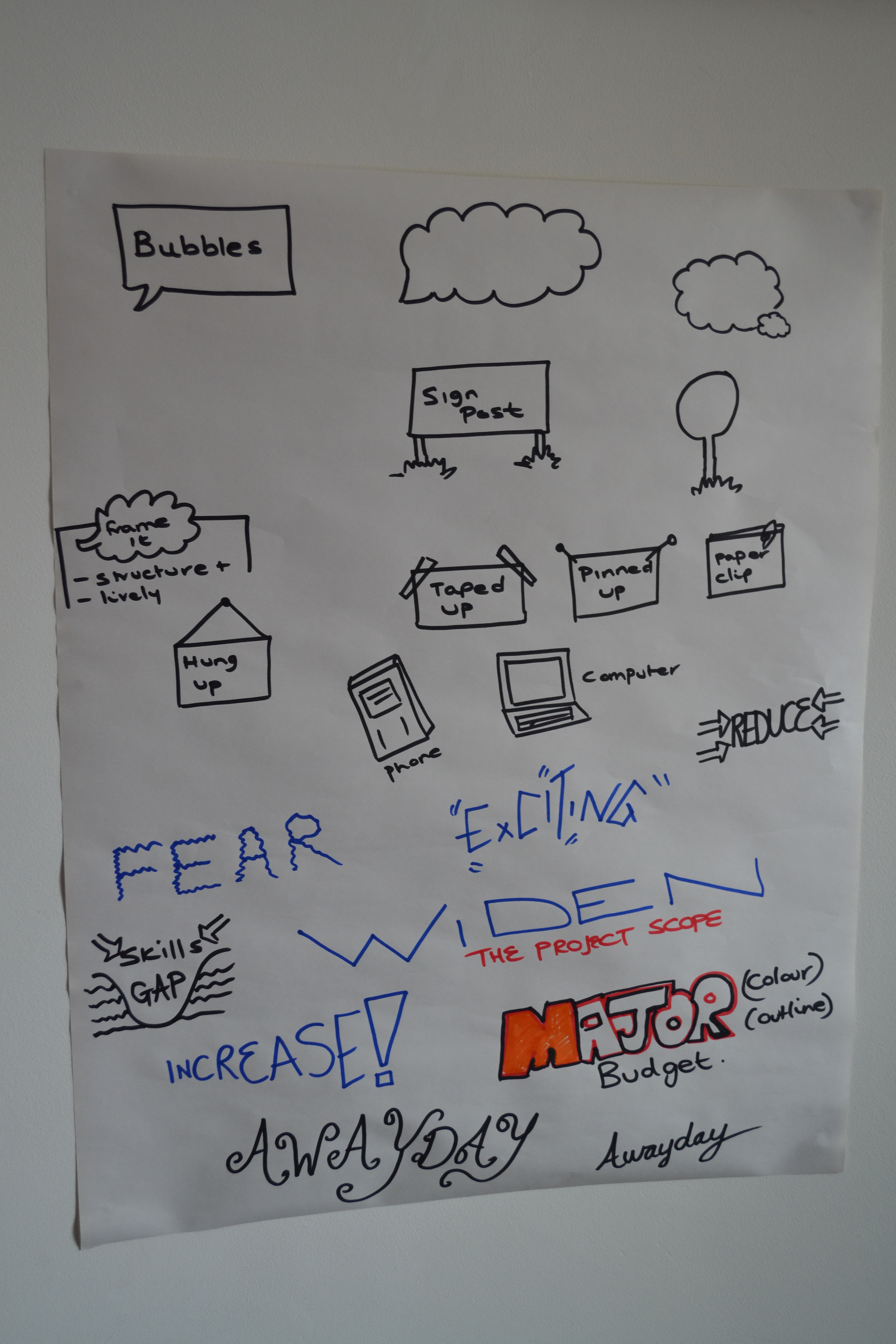
7) Images/ Icons
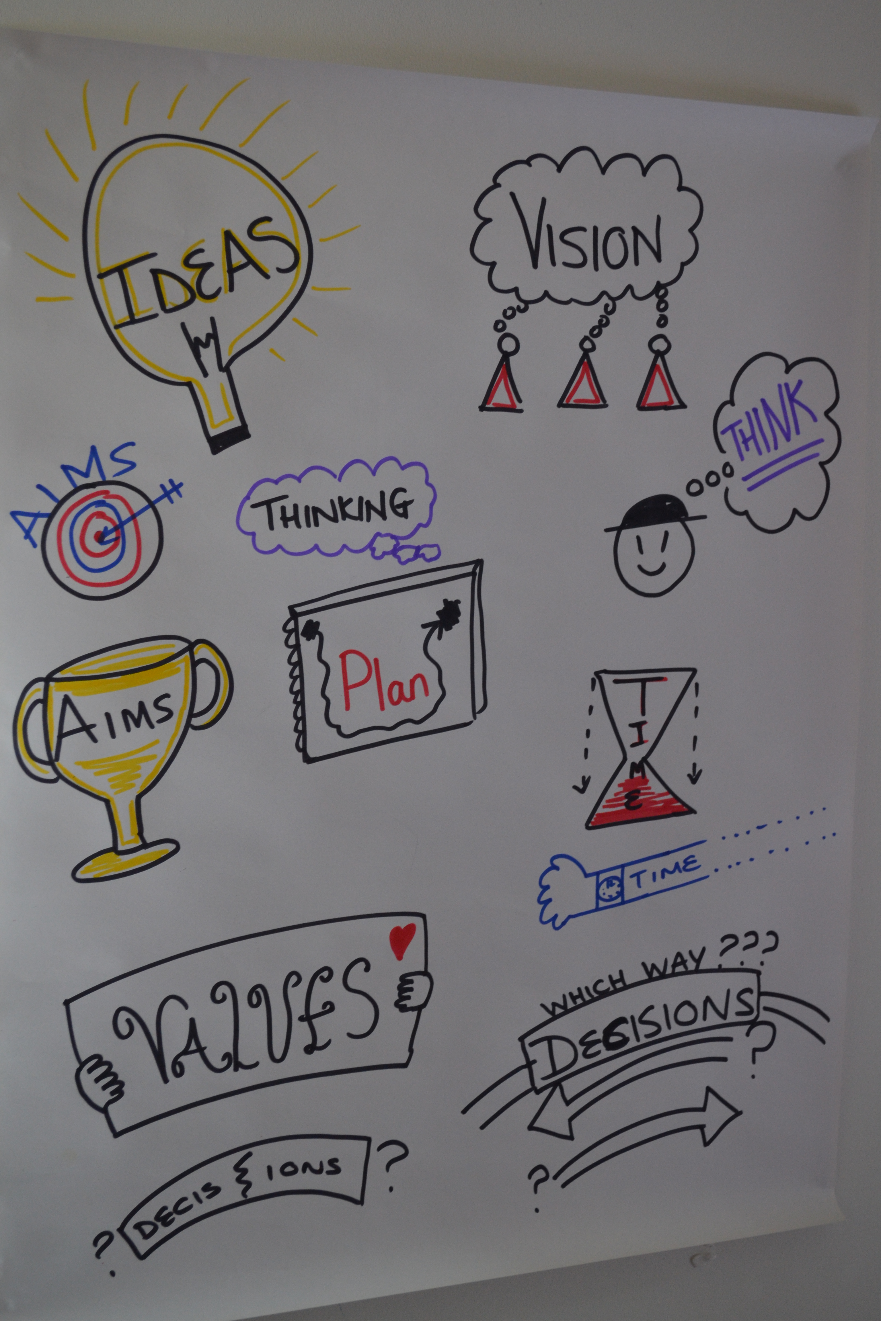
Images can be used to depict whats being said. Its a great idea to think about commonly used phrases in your industry and have an image in mind that can be pulled out when needed, almost like a mental gallery. We practiced, with Fran calling out words, and us using typography (font) that we felt reflected the words, as well as more concrete images to describe what she was saying. This can be quite difficult to do on the spot, especially when the next word or phrase follows in quick succession, as it very well might in a real life situation that you are facilitating.
Here are some of my examples for Time, Vision, Values, Aims, Decisions, Ideas, Thoughts:
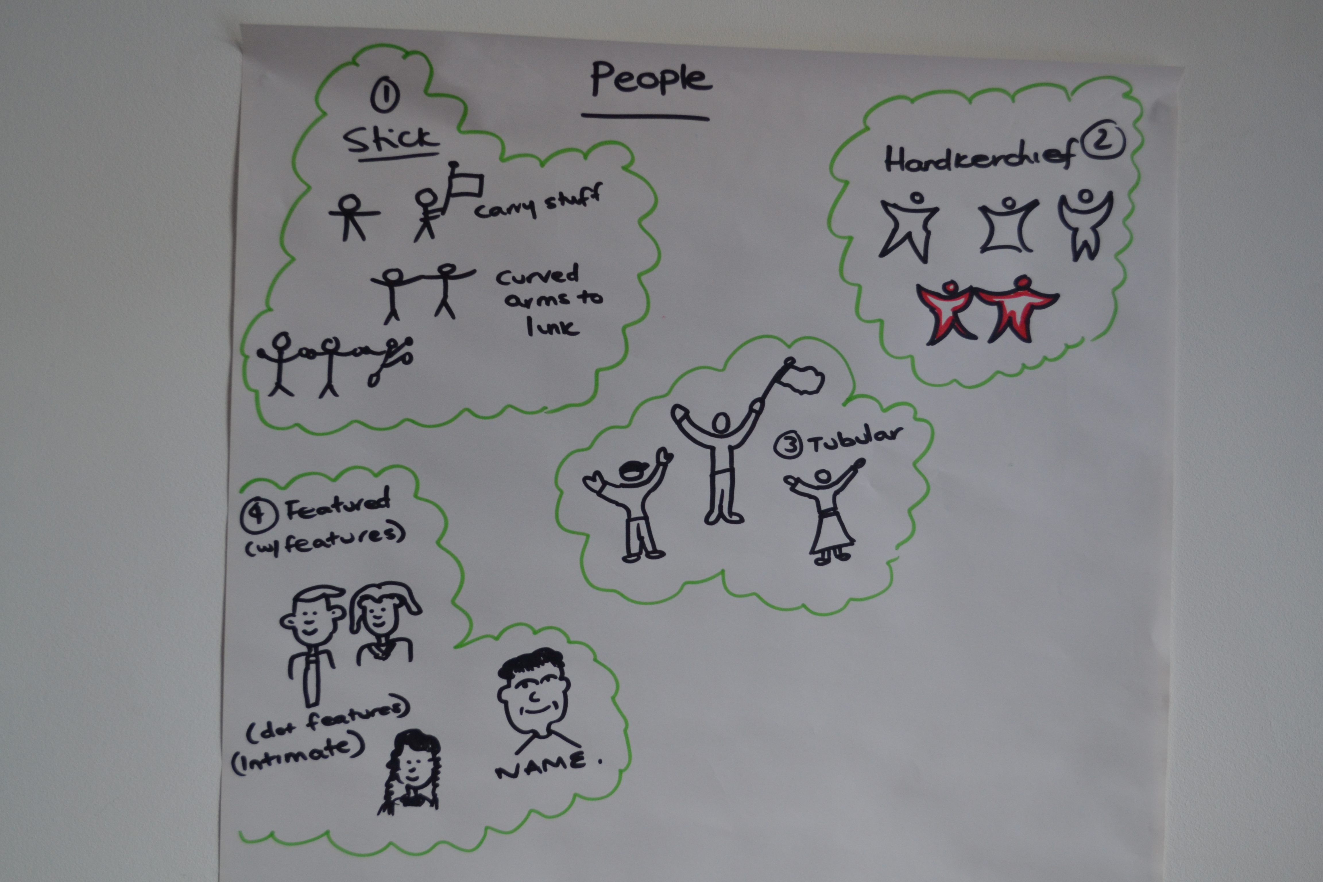
8) People
Depending on yr level of confidence in drawing there are 4 types of people u can use:
– Stick men
– Handkerchief men
– Tubular men
– With Features
Bearing in mind that you rarely need to draw a huge person with very specific features, it might be that a handkerchief man works just fine in most cases. All you want the audience to see is that it is a person, and he thinks/ feels/ is doing something. You can make him active using a few lines to indicate movement, make him interact with others- e.g holding hands, or he can carry something, like a flag/ signpost.
Obviously it goes without saying for each of these types of person, the ‘he’ could just as equally be drawn as a ‘she’ as and when required. 🙂
And Finally…we try it out for real.
Taking it in turns in pairs, we had to tell each other a story about a meeting that we had been in, and have it visually scribed by the other! harder than it looks, but made easier by bearing all the tools and tips in mind! Here is my attempt- see if u can follow the story 😉
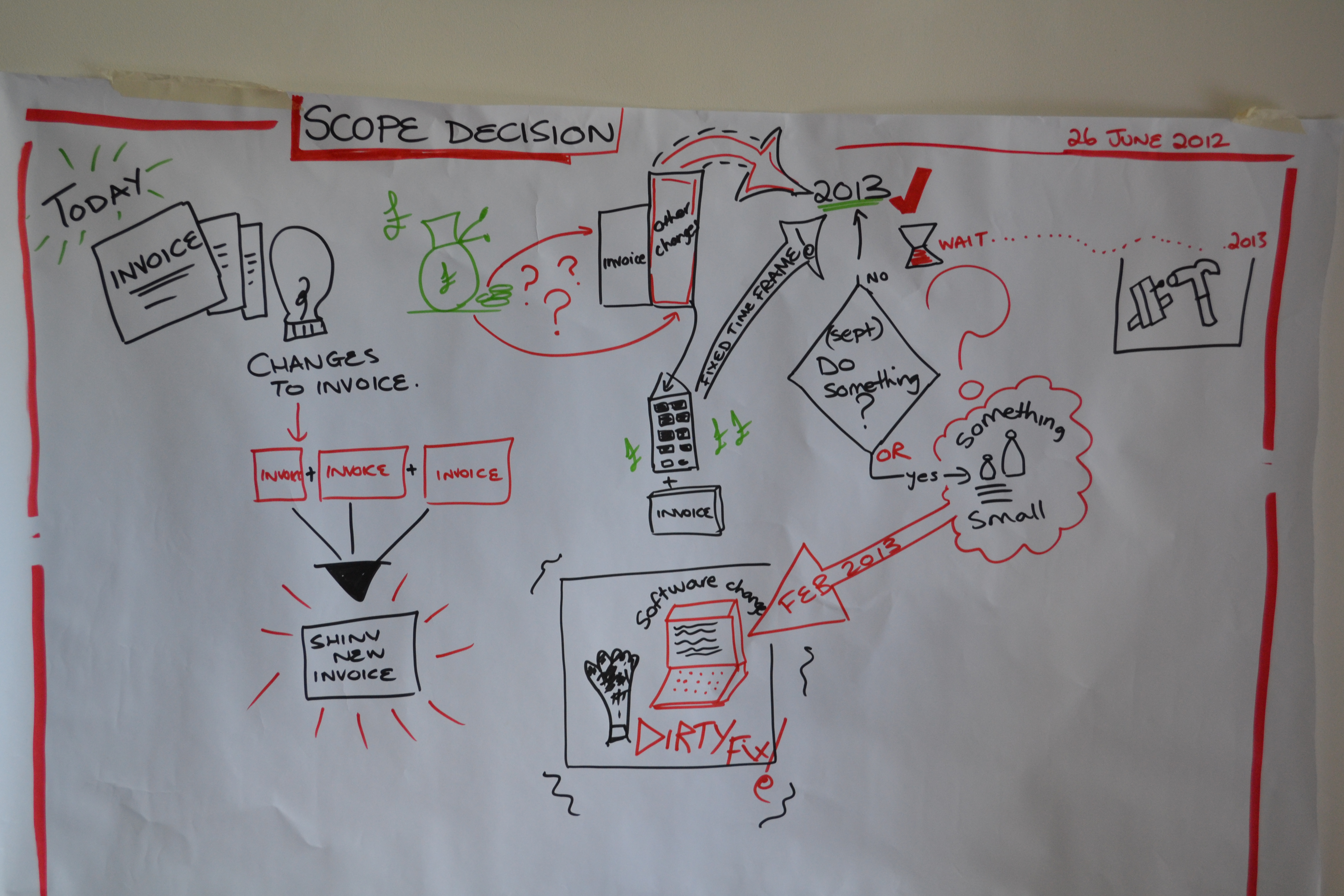
I’m definitely going to be trialling this technique a bit more in coming weeks. It was awesome! I finished the day completely inspired, and covered in pen!
There’s so much more I could share, but his post is too long already! Give me a shout if you want more info, or details of the training.
Fantastic post! I have sent this round the Scrum masters at TJG. What was the exact course you attended?
Thanks Jen, Im so glad you enjoyed it! The course was awesome and I can highly recommend it as a place to begin.
It was with a lady called Fran O’ Hara. You can find details on her website: http://www.franohara.com